| Page |
|
© Peter Broadfoot 2008
Histograms
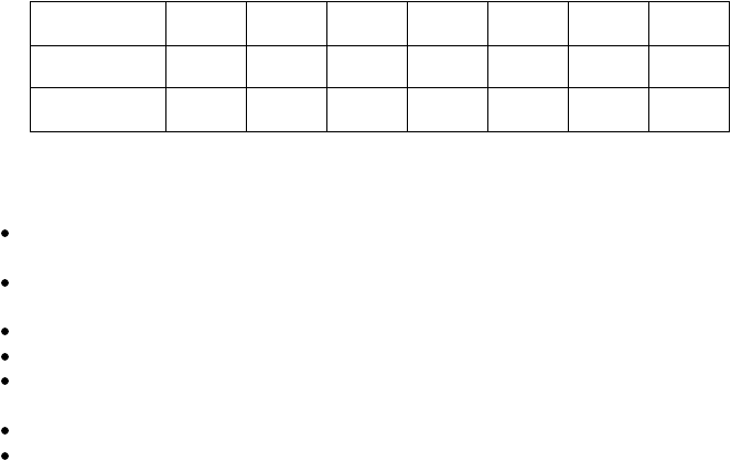
Use the histogram to complete a copy of the table below, giving the frequency and mid-
point (the time-value at the middle of the interval) for each class interval. The first row,
labelled Time t, is the class interval. The 1st column shows that 3 runners ran in times
from 7 up to 8 minutes.
Times Taken to Run a Race
Time t
(minutes)
7≤t<8
8≤t<9
9≤t<10
10≤t<11
11≤t<12
12≤t<13
13≤t<14
Frequency
3
Mid-point
(minutes)
7.5
Summary
So far we’ve looked at a simplified form of histogram. The main points are:
a histogram is a frequency diagram. It is similar to a bar chart but with some important
differences.
the data’s values are continuous (the variable is continuous) – any value is possible
within the data range.
the data are grouped into classes.
the class widths are equal.
because the variable is continuous, the x-axis is a continuous numerical scale, just like
the scale used on a standard x-y graph.
the width of a bar on a histogram spans the class interval – therefore adjacent bars touch.
the height of a bar is the frequency (the number of data in the class).
The width of a bar on a histogram corresponds to the class width, which is the range of
values included in the class. So far we have simplified and kept the class width constant.
The classes and therefore the histogram bars do not have to be a constant width. This
complication is dealt with in the section on Frequency Density.
Discrete Data
You may come across histograms of discrete data, such as marks in a test. In a GCSE
Maths histogram question, the data will almost certainly be continuous or can be treated as
continuous. In this booklet we may have implied that grouping data is necessary for
continuous data only and, by implication, that a chart of grouped data (a histogram) is only
ever used with continuous data. In fact, discrete data has to be grouped when there is a
large range of data, otherwise there would be too many bars on the bar chart. The resulting
grouped frequency distribution is then plotted as a histogram or a frequency polygon.
Deciding on the class boundaries is a little more complicated than with continuous data.
Test marks could be grouped from 0 to 24, 25 to 49, 50 to 74 and 75 to 100. That’s too few
classes, but it is only an example. The class boundaries have to be midway between the
upper mark for one class and the lower mark for the next. For the class 25 to 49, the lower
boundary is 24.5 and the upper boundary is 49.5. The class width is 25. This is really
beyond GCSE Maths – but at least you should not be surprised if you do see grouped,
discrete data used with a histogram.