| Page |
|
© Peter Broadfoot 2008
Histograms
0
1
2
3
4
5
6
7
8
3
4
5
6
7
8
9
10
We’ll add the rest of the data to the histogram, shown in this table. It doesn’t matter what
the values represent. We’ll call the variable x.
w
f
fd=
f
/
w
4 ≤ x < 5
1
4
4
5 ≤ x < 6
1
4
4
6 ≤ x < 7
1
6
6
7 ≤ x < 8
1
6
6
8 ≤ x < 9
1
4
4
9 ≤ x < 10
1
4
4
There are six classes. The first class is from 4 to 5 (4≤ x <5). The widths are all equal to
one and so again, the frequency densities (fd) equal the frequencies (f).
The diagram will be identical if we plot frequency density
instead of frequency. The heights of the 1st two boxes are
equal, as are the middle two and the last two. That is not
necessary but the shape is easy to recognise and the
explanation should be easier to follow. Now we’ll group
differently. We’ll merge some of the classes to see the effect
on the shape.
The data from the first two classes are merged into a single class from 4 to 6. The
frequencies add, e.g. 4+4=8. Similarly the last two are merged into a class from 8 to 10.
w
f
fd=
f
/
w
4 ≤ x < 6
2
8
4
6 ≤ x < 7
1
6
6
7 ≤ x < 8
1
6
6
8 ≤ x < 10
2
8
4
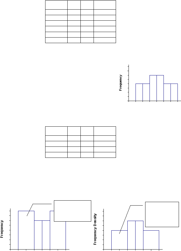
The histogram, below left, is now the wrong shape. The two wide bars are taller than the
central narrow bars, because we’ve used frequency for the height of a bar. If the classes are
different widths then, to keep the correct shape and height, the histogram must be drawn
using frequency density – below right. When classes (bars) are merged their areas add (not
their heights), so that the area of the new class equals the total area of the merged classes.
0
1
2
3
4
5
6
7
8
3
4
5
6
7
8
9
10
0
1
2
3
4
5
6
7
8
3
4
5
6
7
8
9
10
This is wrong because
we used Frequency,
not Frequency
Density
This is right – its
area equals the
combined area of
the two classes that
we merged