| Page |
|
© Peter Broadfoot 2008
Histograms
Frequency Diagrams in the Exam
Coursework
When doing statistics coursework you have to decide about what types of chart to use. If
the data are continuous, you have to group the data. Choose a suitable class width to give a
sensible number of classes. You should have no less than 5 and no more than about 15
classes on a chart. There is no exact rule. A ‘rule of thumb’ is that the number of classes
should be about equal to the square root of the number of data values in your sample. If, for
example, your sample has 100 items (continuous data), you make about √100 = 10 classes.
Even if the data are discrete, you may still decide to group, but you should consider
grouping only if your data range is a least 10. For example, if the data are possible dice
scores, from 1 to 6, you should not group. If you are comparing the lengths of sentences in
newspapers, the range is large and so you need to group. For example, this sentence
contains about fifty characters. Whatever you decide, you have to explain the decision.
About Exam Questions
After 2008, there is no GCSE Maths coursework component. Exam questions on drawing a
histogram (Higher tier) have so far been rare. With the end of coursework it is possible that
such questions will become more common. You are advised to practise drawing histograms
by hand on graph paper.
A question may ask you to draw a “frequency diagram”. You could interpret this as
meaning a bar chart, a histogram or a frequency polygon (next section). Be guided by the
question – if the data are not grouped (and you are not required to group) then you could
draw a simple bar chart. It is more likely that the data are grouped, in which case use a
histogram or a frequency polygon.
It is unlikely that you will be expected to draw a histogram of grouped discrete data in an
exam question. You are expected to be able to use a grouped frequency table, e.g. to
estimate the mean test mark for a class of students. You use the mid-point values.
An exam question on drawing a histogram will almost certainly provide the table of
grouped data and a grid for the chart.
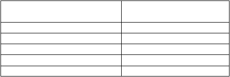
Exercise 3 – Draw a Histogram
Using graph paper, draw a histogram to represent the data given in the following frequency
table of continuous data. Be sure to give the graph a title, and to label both axes clearly.
Remember that the bars must touch. There is no need to shade the bars.
Table of Weights of Children
Weight W (kg)
Frequency f
(number of children)
20 ≤ w < 25
15
25 ≤ w < 30
65
30 ≤ w < 35
50
35 ≤ w < 40
20
40 ≤ w < 45
10