| Page |
|
© Peter Broadfoot 2008
Histograms
Grouping
A main difference between a bar chart and a histogram is that, with a histogram, the data
are grouped. How would you use a bar chart to represent the “distance travelled” data? A
bar chart shows discrete data. You could count the number who travel 1mile, then 2miles,
and so on, and plot that as a bar chart, with a bar for each mile.
Distance, however, is a continuous variable, so how would you include those who travel
distances in between, such as 1.4miles? Perhaps you could approximate the distances to the
nearest mile. For example, if the distance is 1.4miles, round it down to 1mile and, for
1.6miles, round it to 2miles. Then use a bar chart with a bar for each mile.
That is similar to what we do. The data between 1.5 and 2.5miles could be rounded to
2miles – so that those data are included in the 2miles bar. A better description is that we
lump together all the data from 1.5 to 2.5miles and place them in a 2miles group. It is
called grouping. However, unlike a discrete bar on a bar chart, which represents only one
value, a bar on a histogram represents a whole range of values – in this example, from 1.5
to 2.5miles. On the histogram the bar’s width is important. The width of the bar is made to
stretch the width of the group, from 1.5 to 2.5miles, to remind us that the data in the group
can be anywhere between 1.5 and 2.5miles. The bar’s height is the count of data items in
the group, in this case 30 people. The next group, from 2.5 to 3.5miles, is also 1mile wide
and is centred on 3miles.
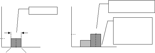
The left diagram below shows just the 1.5 to 2.5miles group. The bar represents the 30
people who live between 1.5 and 2.5miles from work (f=30). To simplify, instead of
grouping from 1.5 to 2.5miles, we’ll use whole numbers. We can group from 1 to 2,
followed by 2 to 3, then 3 to 4miles, etc.
The right-hand diagram shows the alternative – two groups, from 1 to 2 and from 2 to
3miles, are shown. There are 40 people in the 2nd group. The mid-point for the 2nd group
is 2.5miles. Unlike a bar chart, it is not necessary to label the value at the mid-point on the
axis. The boundaries between groups line up with divisions on the x-axis, 1, 2, 3 etc.
To summarise, in the employees example you could place those who travel between 1 and 2
miles in a group that extends from 1 up to 2miles. The 1.4miles goes in that group. Those
between 2 and 3miles go in the next group, and so on. Each bar is one mile wide. In GCSE
Maths questions it is normal to make the boundaries between the groups coincide with the
divisions on the x-axis like this. This is to make the histogram as simple and as easy to use
as possible. By choosing groups starting at 1 mile and with a width of 1 mile, the
boundaries of the groups, and the x-axis divisions, are at 1mile, 2miles, 3miles etc.
Mid-point (at 2.5) not
shown on x-axis
upper limit
= 2.5
lower limit
= 1.5
2
width = 1mile
f =30
These boundaries
between adjacent
groups are labelled 1,
2, 3 etc. and form the
scale on the x-axis.
2
1
3
4
0
2.5
f =40