| Page |
|
© Peter Broadfoot 2008
Histograms
0
2
4
6
8
10
12
0
1
2
3
4
5
6
Occupancy
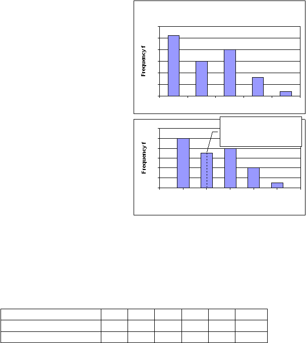
The mid-point of the
2nd bar lines up with 2
on the x-axis
Comparison of Qualitative and Quantitative Bar Charts
In this qualitative bar chart on pet
ownership there are 5 categories of animal.
The frequency is the number of pets in
each category. You can see that 15 of the
animals are dogs and only 2 are pet rats.
The order is alphabetic from left to right.
The next bar chart is quantitative. It shows
the number of people living in thirty
apartments. None of them is empty.
The horizontal axis (the x-axis) shows the
occupancy. The range is from 1 to 5
people. The occupancy is quantitative. It
is discrete, because a number of people is
an integer. You can’t have 1.5 people.
The frequency is the count of apartments
for each level of occupancy. For example,
10 of the apartments are each occupied by
one person only, so the frequency is 10.
How many are occupied by 5 people?
In a question you could be asked to work out the total number of apartments. You add
together the frequencies (the heights) of the bars. The total frequency is:
10 + 7 + 8 + 4 + 1 = 30 apartments
How many people in total live in apartments occupied by 3 people? There are 8 apartments
occupied by 3 people per apartment, so the total occupancy is 8 × 3 = 24 people.
Calculations like these are best completed in a frequency table:
Occupancy x
1
2
3
4
5
Totals
Frequency f
10
7
8
4
1
30
Total Occupancy f × x
10
14
24
16
5
69
The x-axis on a Quantitative Bar Chart
A quantitative bar chart is used for discrete data only. The x-axis looks like a scale. It
shows all the possible values in numerical order. In the Occupancy chart, the bars are in
ascending order of occupancy from left to right. The x-axis is labelled with the integers 0 to
6. The labels are equally spaced because the occupancy increases in equal amounts. If
there are no apartments with, for example, 3 occupants there is no bar, but you still label 3
on the axis. The 0 and 6 labels can be omitted because they are outside the data range. The
bars are positioned so that the middle of each bar is aligned with the value on the x-axis.
The width of the bars on a bar chart has no mathematical significance. In fact, a maths view
is that the bars on a quantitative bar chart should be vertical lines, with no width. The
appearance of the bars has more to do with style than maths. A coloured bar with width
simply looks better than a thin, vertical line.
Bar Chart - Pets
0
5
10
15
20
25
30
Cat
Dog
Hampster
Rabbit
Rat