| Page |
|
© Peter Broadfoot 2008
Histograms
Revision of Bar Charts
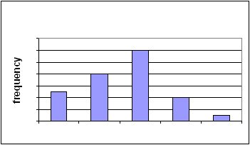
A Qualitative Bar Chart
A bar chart of the colours of shirts, worn by children in a class, shows the number of
children wearing the different colours. You could have 5 wearing red, 8 with green, 12
with blue, 4 with white and so on. The colours are called categories. The number of shirts
of each colour is called the frequency. The frequency of green shirts is eight. Those
numbers, the frequencies of the different categories, are called a frequency distribution. A
table of the categories and frequencies is called a frequency distribution table or, more
simply, a frequency table.
A frequency diagram is a chart of the frequencies of the different categories. A bar chart is
a frequency diagram. It is a graphical display of the frequency distribution. A frequency
diagram is easier to interpret than a table of the frequencies. It is easier to see a pattern.
Using suitable scales, labelling and shading will make the diagram more readable.
In the shirt example the categories are the
colours. The bars could be in any order –
either an ascending or descending order of
height may be preferred. The frequency
scale starts at zero. The divisions on the
frequency axis are equally spaced.
You will meet two more types of frequency
diagram in this booklet, both based on a bar
chart: histograms and frequency polygons.
Qualitative and Quantitative Data
Data can be qualitative or quantitative. ‘Quantitative data’ means that the values of the
data can be counted or measured, such as the number of kittens in a litter or the weight of
sacks of flour. The number of kittens can be counted, so that is discrete quantitative data.
You can have 2 kittens or 3 kittens but nothing in between. The weight of a sack can be
measured. It can have any value within a range and so weight is continuous. Here’s a
small sample of continuous data, the weights, in kilograms, of six small children: 20, 24.5,
28.1, 30, 32.5, 35. The word ‘continuous’, when applied to data, does not mean that every
possible value must be present in the sample. None of the six children weighs 26.8kg, but it
is possible to weigh that amount, or any value within a range. Therefore weight is
continuous.
Qualitative data are neither measurements nor counts. Examples of qualitative categories
are colour (e.g. of shirts) and names (e.g. of products). The colour red is not a
measurement. An instrument can measure a colour in the sense that it can measure the
wavelength of the colour and then identify the colour as red. The word ‘red’ is not the
measurement – it is just a name and so is qualitative.
The qualitative bar chart is the simplest type of frequency diagram. Frequency diagrams of
quantitative data, particularly continuous data, are more complicated. In the next section
we compare a qualitative with a quantitative bar chart.
Shirt Colours
0
2
4
6
8
10
12
14
red
green
blue
white
black