| Page |
|
© Peter Broadfoot 2008
Histograms
0
20
40
60
80
100
120
140
160
0
1
2
3
4
5
6
7
8
9
10
11
1
Distance d (miles)
0
10
20
30
40
50
60
70
80
90
0
1
2
3
4
5
6
7
8
9
10
11
12
13
14
Distance d (miles)
The Effect of Class Width
Two researchers independently analyse the same raw data for the ‘distance travelled’
histogram. The 1st researcher groups the data into 2mile widths as in the histogram on the
previous page. The 2nd uses 1mile widths. So far, there is no problem.
Distance d
(miles)
Frequency f
Class Width
w (miles)
Frequency Density
fd (per mile)
1≤d<2
20
1
20
2≤d<3
40
1
40
3≤d<4
65
1
65
4≤d<5
85
1
85
5≤d<6
70
1
70
6≤d<7
50
1
50
7≤d<8
45
1
45
8≤d<9
45
1
45
9≤d<10
20
1
20
10≤d<11
10
1
10
11≤d<12
4
1
4
12≤d<13
8
1
8
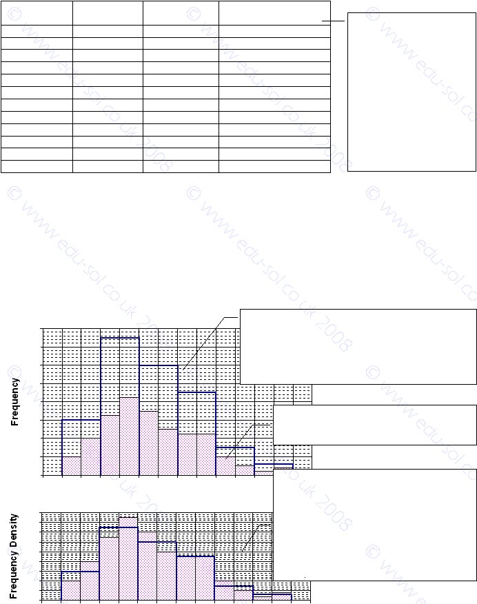
The diagrams below show the 1mile and the 2mile histograms superimposed. Those two
histograms should have similar shapes and heights, because they are based on the same raw
data. On the 1st diagram, frequency is used on the y-axis. As a result the histograms are
difficult to compare, because the 2mile histogram with the blue border is the wrong height.
It is, on average, twice as high as the 1mile histogram. That’s like concluding that petrol is
twice the price, because the price quoted is for two litres, not per litre. The 2nd diagram
uses frequency density. Now the similarity of the two histograms is clear.
Comparison of the Histograms
This diagram attempts to compare the shapes of the two
histograms. The problem is that the bars on the blue,
2mile histogram are about twice the height, on average,
compared with the shaded, 1mile histogram. The
histograms are difficult to compare. The problem occurs
because we plotted frequency.
Here we used frequency density, so the histo-
grams are scaled correctly. A comparison is
easier. You can see that they are similar shapes
and heights. The shapes are slightly different
because of the different class widths. It is not
certain, but the 2mile width seems to produce a
slightly smoother outline. Look carefully. You
can see that the areas of the histograms are
equal, which they should be for the same data.
The data as grouped by the
second researcher, into 1mile
widths. Because the width is
1mile, the frequency and the
frequency density are equal.
We haven’t discussed why
they have grouped into
different widths. This is just
an example. However, it is
worth noting that, by
adjusting the class width,
you can improve the shape of
a histogram.
The shaded histogram is the correct height,
even though frequency is plotted. Why? For a
1mile width, frequency equals frequency