| Page |
|
© Peter Broadfoot 2008
Histograms
Comparison of Frequency with Frequency Density
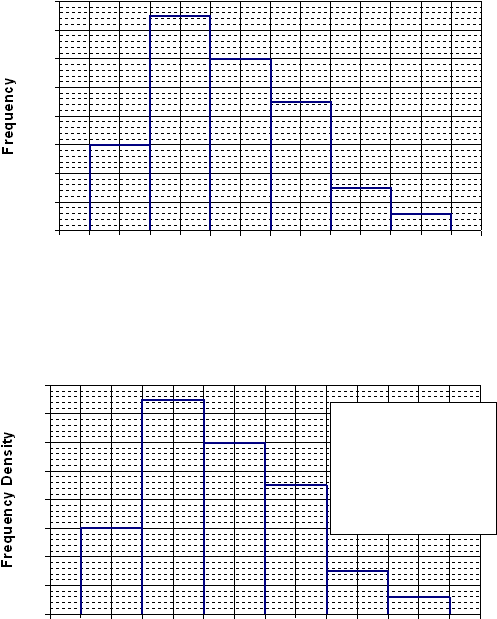
This is the simplified histogram from page 4, drawn with the height of each bar equal to the
frequency. The class width is two miles, there are six classes. The first bar represents the
60 people who live between one and three miles from work.
The correct histogram (below) uses the frequency density for the height of each bar. What
effect will that have? The two diagrams may appear identical. The scales on the y-axis,
however, are different.
Using frequency instead of frequency density on a histogram is not completely wrong.
Provided that all the bars are the same width (they are in this example) then the frequency
and the frequency density are proportional. Your histogram will then have the correct
shape, as you can see. The problem is that, if you plot the frequency, the heights of the bars
are not standardised. In this example the bars are too high. This makes two histograms,
with different class widths, difficult to compare, as we shall see.
On the next page, to show the effect of changing the class width, the ‘distance travelled’
data are regrouped into 1mile class widths. Then the two histograms, for the 2mile width
and the 1mile width, are compared.
0
20
40
60
80
100
120
140
160
0
1
2
3
4
5
6
7
8
9
10
11
12
13
14
Distance d (miles)
0
10
20
30
40
50
60
70
80
0
1
2
3
4
5
6
7
8
9
10
11
12
13
14
Distance d (miles)
The frequency density
for each class is the
class frequency divided
by the class width. For
example, for the class
from 1 to 3 miles
(1≤d<3), fd = 60/2 = 30