| Page |
|
© Peter Broadfoot 2008
Histograms
Comparison: Times to Run a Race
0
2
4
6
8
10
12
20
25
30
35
40
45
50
55
60
65
70
75
80
85
90
95
100
Time (minutes)
Exercise 4 continued
a)
Is the data continuous or discrete?
b)
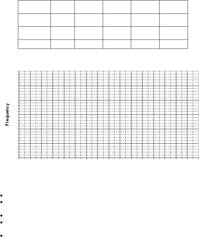
On (a copy of) the grid provided below, draw separate frequency polygons for the men
and the women. Label the diagram fully.
Note: you may wish to use a copy of this table to record the mid-points before you plot the
graph.
Time
(minutes)
30≤t<40
40≤t<50
50≤t<60
60≤t<70
70≤t<80
Frequency:
men
0
4
3
8
10
Frequency:
women
2
6
8
6
3
Mid-point
Summary
The main points about a frequency polygon are that:
a frequency polygon is a frequency diagram. It is called a polygon because of its shape.
the frequencies are plotted against the mid-point values – the plotted points are then
joined by straight lines – the result resembles a standard x-y graph.
it is normally used for grouped data and is an alternative to a histogram.
the advantage of a frequency polygon is that you can easily compare two sets of related
data on the same chart – for example, the marks in a test for 50 men and 50 women.
not an essential point for GCSE – the area of the polygon equals the total area of the bars
on the corresponding histogram. You may be able to spot that on the chart, page 11.