| Page |
|
© Peter Broadfoot 2008
Histograms
Sample Exam Question – Frequency Diagram
The question is based on AQA GCSE Maths Module 1 Intermediate, March 2005, Section
B, question 7.
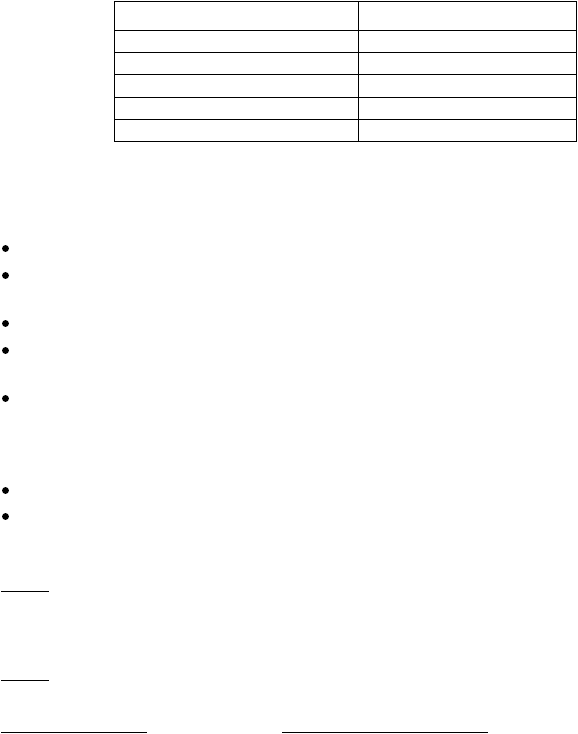
The frequency table shows the prices of over 100 models of TV. Draw a frequency
diagram to represent the data. (3 marks)
Price £x
Frequency
150 ≤ x < 200
15
200 ≤ x < 250
36
250 ≤ x < 300
62
300 ≤ x < 350
18
350 ≤ x < 400
10
The question includes a grid to draw the chart – but the axes are not labelled. The grid and
a summary of the examiner’s report are on the next page.
Things to notice about this question:
The price is represented by x.
The class intervals are shown as, for example, 150 ≤ x < 200. Don’t be put off if, in a
question, the ≤ and the < are swapped, as in 150 < x ≤ 200. See the note on the next page.
The data are continuous and are grouped into five equal classes, width £50.
The question asks for a frequency diagram. You can choose to draw a histogram or a
frequency polygon.
In this question, label the y-axis Frequency and the x-axis Price (£). If you draw a
histogram, do not use frequency density (Higher tier only). This question expects you to
use frequency. It will be clear, from the question, if you are expected to use frequency
density. If the classes have varying widths, use frequency density.
You must decide on suitable scales for both axes, e.g. £100 to £450 on the x-axis.
You must label the scale divisions, e.g. 100, 150, 200, 250 etc. on the x-axis.
The marks are allocated as follows:
1 Mark
Suitable scales for both axes.
Frequency scale from 0 (origin).
Price scale linear.
1 Mark
Points plotted at correct heights (correct frequency to the nearest ½ division).
1 Mark for histogram
or
1 Mark for frequency polygon
Bars located with class
boundaries alongside correct
x-values.
plot mid-points and join points
– best to label mid-point
values on x-scale.