| Page |
|
© Peter Broadfoot 2008
Histograms
Advantages of a Frequency Polygon
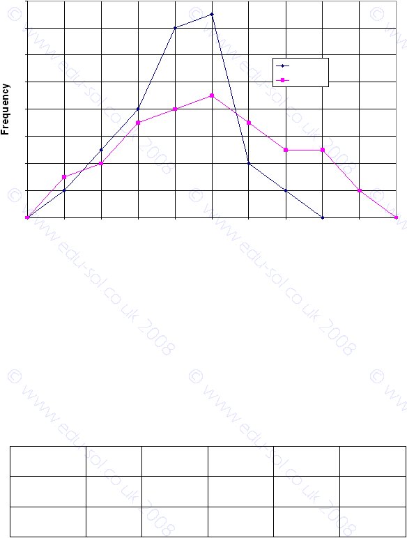
One advantage, from a student’s perspective, of a frequency polygon compared with a
histogram is that a frequency polygon is easier to draw. The main advantage, however, is
that you can superimpose two or more frequency polygons on the same axes and make
comparisons between the sets of data. The diagram shows two frequency polygons for the
marks in two subjects, Maths and English, for the same group of 50 students. In this case it
is quite easy to make a comparison between the two sets of marks.
Some students did very well in maths – eight scored more than 80. You can see that the
middle range of marks, about 40 to 60, is more common in the English results. The modal
group is the same for both subjects (49.5 ≤ mark <59.5)
Data for marks in tests are discrete. Therefore take care, if you get a question on grouped,
discrete data, when you work out the mid-points. The marks were grouped into classes
from 0 to 9, 10 to 19, etc. Therefore the mid-point values are 4.5, 14.5. 24.5 etc. That’s
why the unusual scale was chosen – so that the mid-point positions can be read directly
from the x-scale. A more standard scale could have been used, such as 0, 10, 20 etc.
Exercise 4 – Draw a Frequency Polygon
The table gives the times to run a race for 25 men and 25 women.
Time
(minutes)
30≤t<40
40≤t<50
50≤t<60
60≤t<70
70≤t<80
Frequency:
men
0
4
3
8
10
Frequency:
women
2
6
8
6
3
Contd next page
Marks Out of 100
0
2
4
6
8
10
12
14
16
4.5
14.5
24.5
34.5
44.5
54.5
64.5
74.5
84.5
94.5
104.5
Mark
English
Maths