| Page |
|
© Peter Broadfoot 2008
Histograms
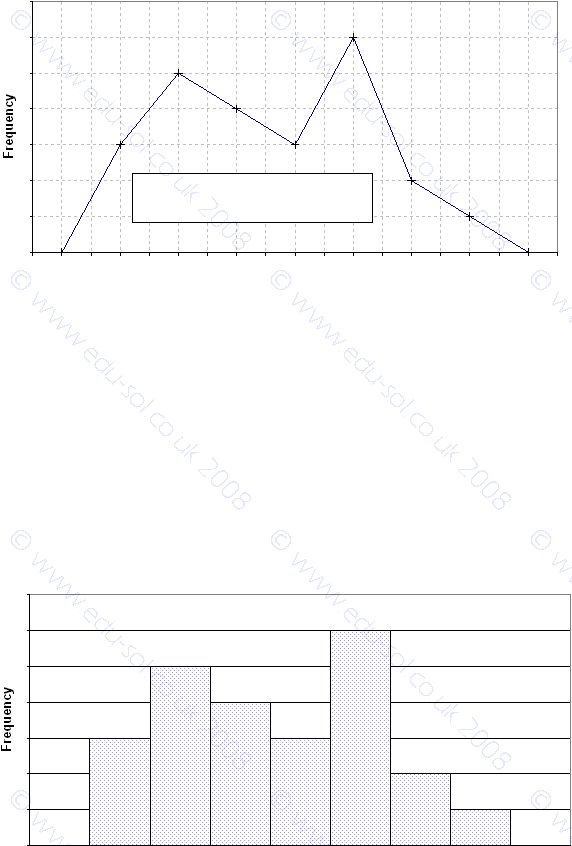
Below we show just the frequency polygon. The mid-point values are plotted (7.5, 8.5 etc).
The x-scale was chosen so that the mid-point values and the class boundaries are shown. It
resembles a conventional x-y plot in which the frequency on the y-axis is plotted against
time on the x-axis.
In an exam question you may be given an empty grid. Take care to label the scales
correctly – you may prefer to label the mid-point values, not the class boundaries, on the x-
scale, to assist in plotting the points at the correct positions.
Using Excel
Using Excel to create charts may be of interest to the reader. The frequency polygon
(above) used the XY (Scatter) chart type. The corresponding Excel histogram (below) uses
the Column chart type. The x-scale shows the mid-point values and not the class
boundaries. It is clear, though, that the class boundaries are at 7, 8, 9, 10 etc. The
combined histogram and frequency polygon (previous page) used both the Excel Column
and the XY (Scatter) chart types, and the x-scale was changed from mid-points to class
boundaries.
Histogram - Times for a Race
0
1
2
3
4
5
6
7
6.5
7.5
8.5
9.5
10.5
11.5
12.5
13.5
14.5
Time (minutes)
Frequency Polygon - Times for a Race
0
1
2
3
4
5
6
7
6
6.5
7
7.5
8
8.5
9
9.5
10
10.5
11
11.5
12
12.5
13
13.5
14
14.5
15
Time (minutes)
The polygon is this shape between
the graph and the x-axis